


Table of Contents
Preparing your artwork to be printed is one of those small steps that really does make all the difference. To make sure our work meets your expectations, it is important to follow some rules when sending us your artwork. No matter what your artwork is, if you upload it out with an improperly prepared computer file, your artwork may come out blurry, change color, and/or be printed incorrectly.
At Sketch Signs, we strive to provide you with any necessary support. Here, you will find what you need to get perfect, print-ready files with ease.
File Format Guidelines
Format is the key. Before your artwork goes into production, you need to make sure that it is saved in such a way as to preserve its integrity. We prefer that your artwork be submitted with us in PDF, AI, or EPS format. This format maintains your lines and color integrity. JPG and PNG format can be submitted if necessary, but only if organized in advance, as they are not necessarily optimal for this type of presswork.
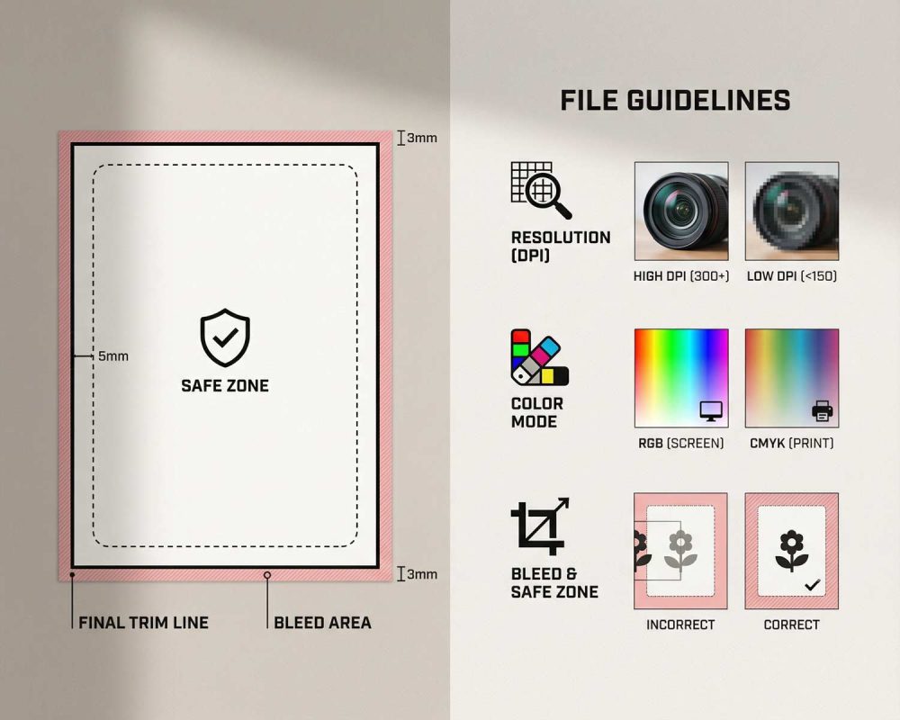
To prevent accidentally trimming anything, make sure all your logos, type, and significant graphic elements are 0.125 inches inside your trim lines. This is your “safe zone,” and all of your design will stay exactly where you placed it.
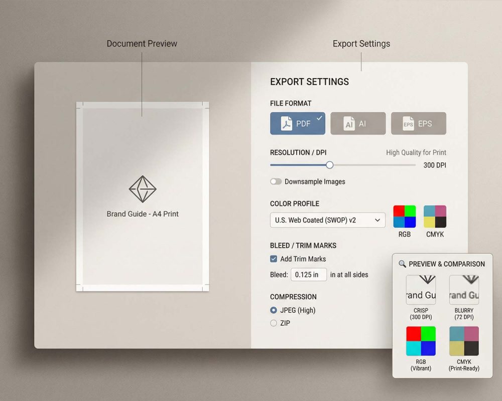
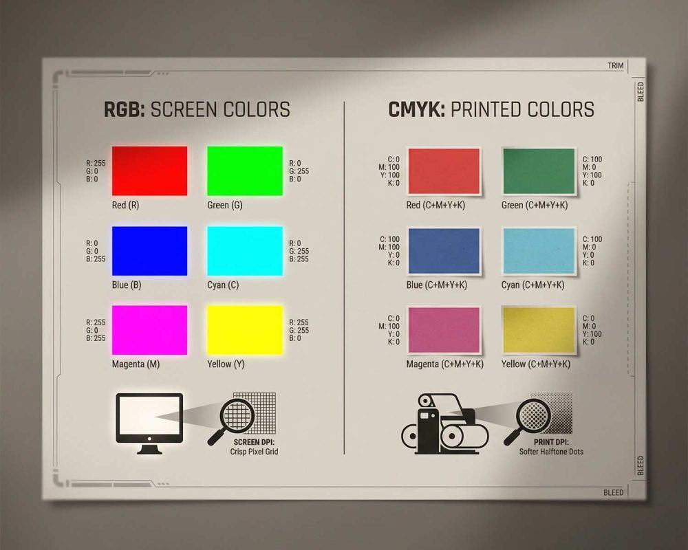
Another aspect you definitely don’t want to fail in is color accuracy. The way in which printers interpret color does not correspond with computer monitor color, so to ensure color accuracy, you can download computer color profiles such as U.S. Web Coated (SWOP) v2 and/or GRACoL.
Finally, your file size. It should measure between 1MB and 10MB. Small files can end up blurry when you print them, and if your file size is too big, uploading your pictures may take longer.
Basically, here’s what you need to remember:
- Formats of choice: PDF, AI, EPS (as well as JPG and PNG if discussed in advance)
- Safe zone: 0.125” inside trim
- Color profiles: v2 or GRACo
- File size: 1-10 MB
Artwork Guidelines
The first step is done, what’s next? After you ensure your file type is right, you need to check if your artwork is set up in order. A print job must include a bleed, which is an area that goes beyond the cut size. This avoids white edges from forming after your item has been cut.
For instance, if your final size is 2″ x 3.5″, your artboard size will be 2.25″ x 3.75″.
To ensure you get a clean and professional print, all pictures and graphics must be at 300 DPI. Anything lower may be considered soft or pixelated.
Another important thing to consider is fonts. The fonts need to be outlined so that there is not an alignment problem when your file is transferred to another computer. We suggest that you avoid font sizes that are smaller than 6 pt.
Remember, if your artwork contains linked images, you must nest those images before exporting your artwork to ensure embedded images.
Finally, change your document color mode to CMYK. This is because if you upload your entire RGB file, then we can reproduce it by converting it, but there may be some variations in color.
Here’s your ultimate checklist for artwork setup:
- Add 0.25″ of bleed to final size
- Resolution: 300 DPI
- Convert fonts into outlines
- Embed all linked images
- Export in CMYK mode
Make Printing Easy From the Start
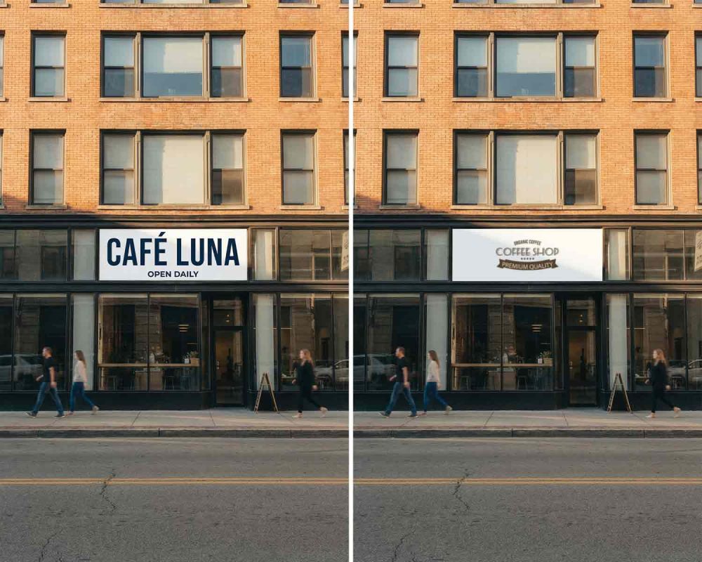
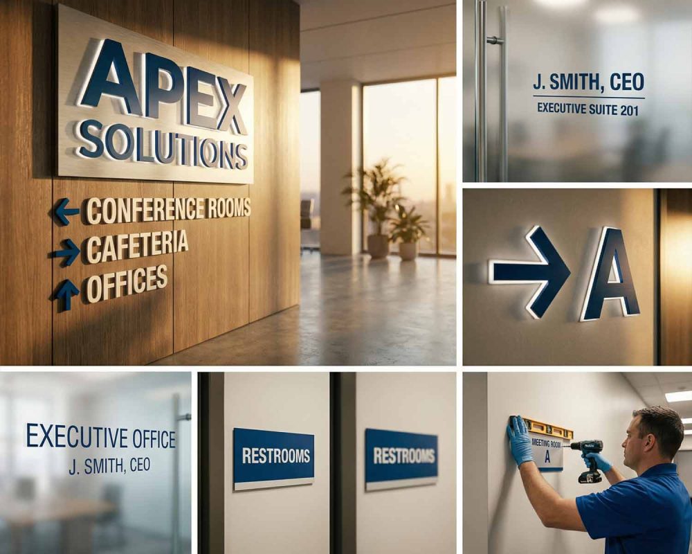
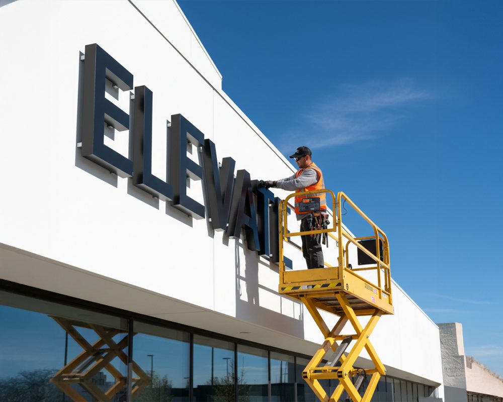
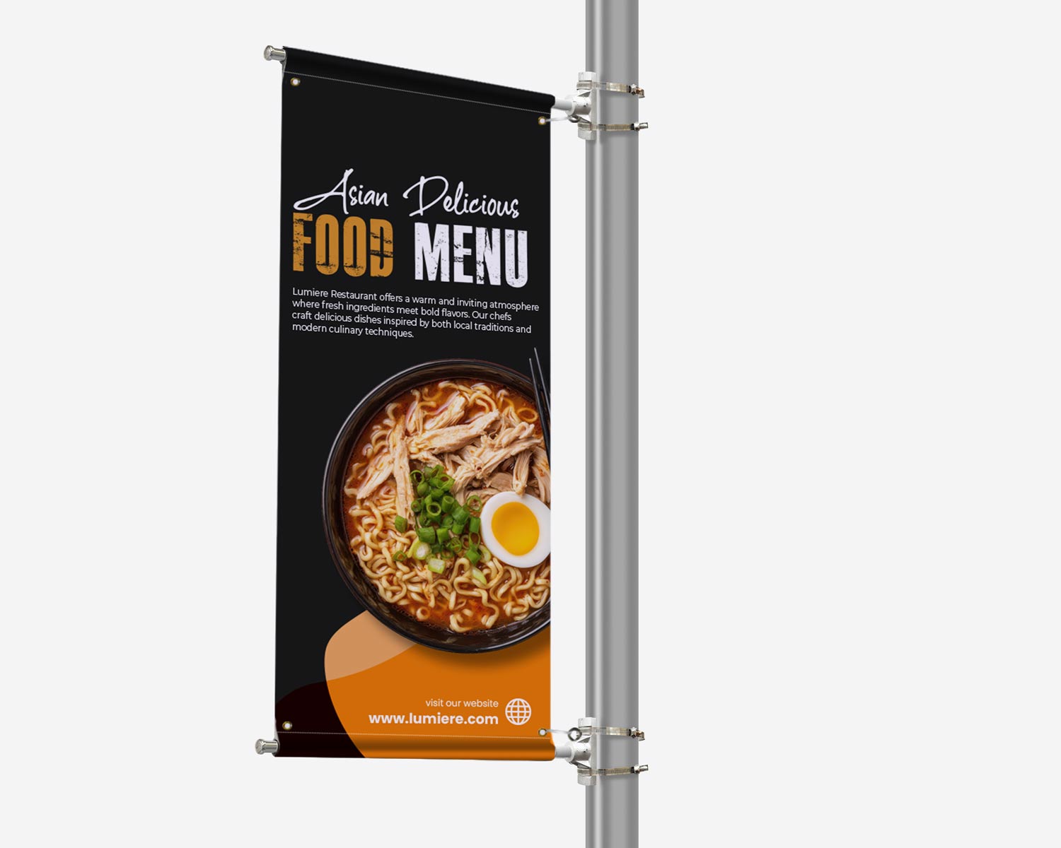
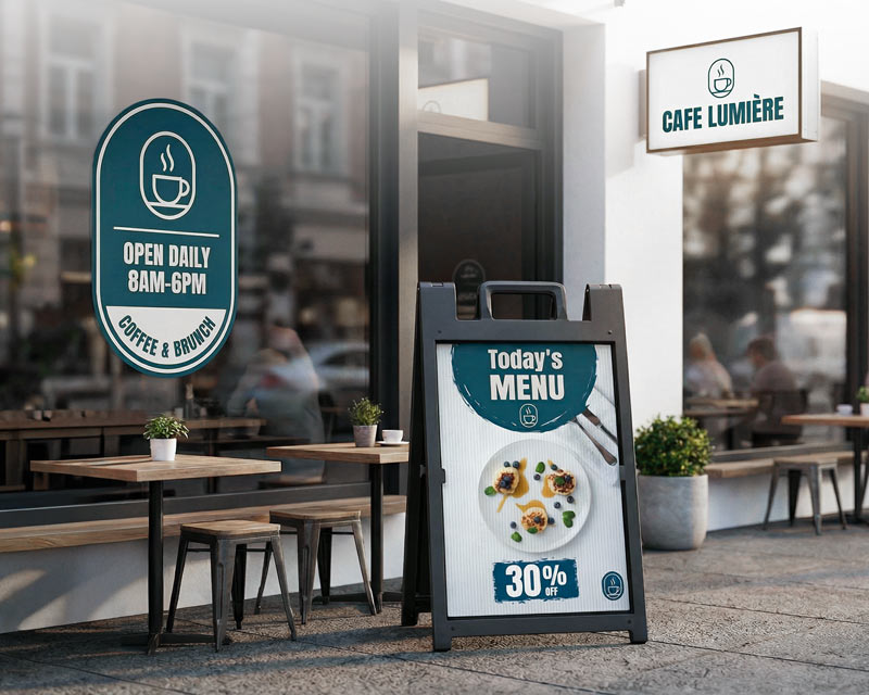
By following these easy steps to prepare your artwork, you can be assured your signs, decals, banners, and business cards will reproduce exactly as you specified, with crisp, bright, and professional results.
And if you ever need assistance with reviewing your case, we at Sketch Signs would be more than happy to help you out.
FAQ
Q: What type of file should be used to ensure optimal print quality?
A: PDF, AI, and EPS formats can be considered optimal as they retain all lines, text, and color accuracy. JPG and PNG formats can be submitted if and when necessary, but they might not be as clean when printed, particularly if they are enlarged.
Q: Why must a safe zone be established around my design?
A: It safeguards key aspects from having trim remaining. To ensure text and logos remain exactly where you need them after trim and cut, keep such aspects at least 0.125″ inside the trim line.
Q: What is bleed, and why is it so important?
A: “Bleed” is the amount by which your artwork exceeds by 0.25″. This is what keeps background colors and graphics from ending up with thin white lines at the edge of your print (you definitely want to avoid this).
Q: What image resolutions should I stick to?
A: Use 300 DPI at all times for any picture or graphic. Anything below can come out blurry and pixelated when printed, even if it may be okay on your monitor.
Q: Is font outlining a process that applies to my fonts?
A: Yes. The outlining of your fonts will ensure your fonts do not move, change, or vanish when your file is accessed by another computer. 6. Why should I design in CMYK instead of RGB? The screen has color in RGB format, whereas the printer has color in CMYK format. So, by designing in CMYK, you can view your colors better before printing. Now, if you upload an image in RGB format, we can still change its format, but there may be some variation in color.